most of your points are refuted in the article. but I'll pick this one : "Display density has increased dramatically" Yes, it has, and Tahoe does not take advantage of this, infact the icons are smaller, and harder to read, using fewer pixels than windows icons of 25 years ago.
Yet, we can't refute that my subjective opinion evaluation of the opening image looks better (for me) , reads better (for me) and is easier (for me) to parse. Either I don't fit the general guidelines, or the general guidelines need a revision, that's my point overall.
But answer me this. You say "but most [but not all? - interesting] of the icons do make it easier, faster and more pleasant for my brain to parse the menu vs no icons."
How does a list of icons that are used inconsistently, duplicated, used in other places, sometimes used and sometimes not used, not to mention illegible, positioned inconsistently, go directly against the broad (reasoned) rules of the Apple HIG, help 'make it easier' as you say?
This is literally what half the article is explaining and you are just saying - no it's easier to not be able to tell an icon apart, and it's easier to have the icons sometimes be the same or move locations, be so small as to be illegible.
How many did you get when the menu text was removed ? I just don't believe it makes it easier. But who am I to argue against someones 'subjective opinion evaluation' I'm just a guy on the internet.
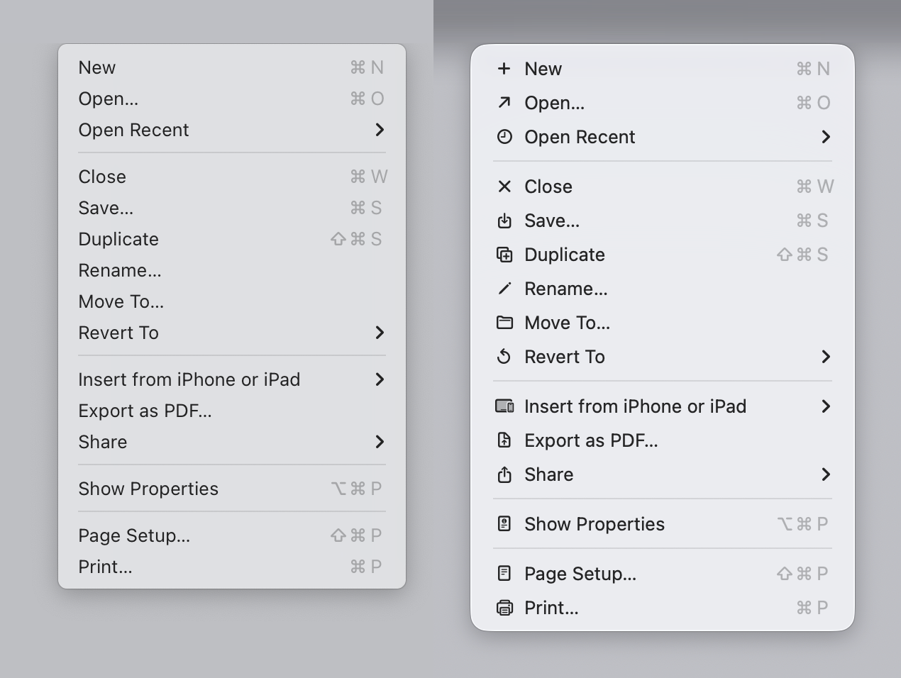
ps I assume by the opening image, you mean the first screenshot supplied by the author of the article - the Sequoia to Tahoe menu comparison, which he brilliantly posted below a shot of the HIG which literally is explaining the exact same thing and why not to do it the Tahoe way. That in it self is confusing.
It makes no sense why Apple chose to do that with Tahoe?
I'll add a general comment - one of the reasons I use Apple systems was they had the UI stuff nailed down. Stuff was consistent. It looked and behaved in proper ways. It felt like a properly designed, holistic approach to UI design. Lately it's just a mess. This article touch the surface of the issues. My current beef is this stupid 'class of window' that appears now and again which is half-way between a dialog and a window. Best place to see it is immediately after a screenshot - click the thumb that appears. This window type doesn't behave like any other window. Z-order, closing, focus, actions that occur when you click certain things, are all different and inconsistent. But it does look a little like IOS though.
> of the reasons I use Apple systems was they had the UI stuff nailed down (...) Lately it's just a mess
I have never daily driven an Apple device, so I can't comment on this; but from what I seen I do agree that Apple UI has not been as consistent lately.
> ps I assume by the opening image, you mean the first screenshot supplied by the author of the article
> How does a list of icons that are used inconsistently, duplicated, used in other places, sometimes used and sometimes not used, not to mention illegible, positioned inconsistently, go directly against the broad (reasoned) rules of the Apple HIG, help 'make it easier' as you say?
Sure! First of all, I'm only commenting on the FIRST image of the blog. There are no duplicated images in it. The icons appear consistently used in that image (maybe export to PDF looks a bit off, but this is a pattern that I have seen repeated on other apps, so I'm used to it). I'm not sure how the icons would look on the actual display, but they look alright on my 4K display as shown on the blog. I also can't comment on they being used "inconsistently" across other parts because I don't use Apple devices.
I'm making a very narrow claim: On the first image, if I compare the menu on the left, with the menu on the right, I prefer the menu on the right. I have tried to "find X" on a menu on the left and then repeat a similar exercise on the right; I am faster on the right and I am more confident on the right. My brain seems to be using the icons as a "fast lookup" and the text to verify the action.
Now, does this translate to all other menus? No! The "File" example he shows is super confusing.
Also, it's possible I would prefer the less cluttered version with less icons. But for me (all icons) > (no icons) on that specific example.
I have not put enough mental energy to agree with the author on all of his individual suggestions across the article, but they look overall fine on the individual examples he provides. I'm just find the first example... not particularly compelling.
> Well - that's just your --- opinion, man
Well... Yes. But unless we objectively measure how I use the computer, that's the best we have got to evaluate my preference.
All my classes on human-computer interaction and design has always been about "listen to your users".
Why build an app? It seems the whole benefit here is it doesnt need any app. Its completely agnostic and simple. The value is in the data and the way he enters it in.
It sounds like a good system but i still believe it takes the discipline of a strong willed person to do the system no matter what system you use.
If i did this i would give up after 2 days. He says he redoes his list every night ready for the next day —- THAT is the secret here, not the specific system he uses.
I’ve tried all sorts over the years different tools, different systems , different philosophies, inbox zero, gtd etc They don’t work for me. I get by with a notepad and pen and i write lists as and when. Theres people out there and some even have YouTube channeks dedicatd to disseminating their productivity hack and workflows for evey tool
Imaginable, and they are really enthusiastic about it.
theres a setting to turn off whole word delete. So if it does the wrong word when you press delete it will only delete the letter by letter not the whole word. It helps but iphone keyboard is still horrendous.
Its just how long you are meant to let the coffee brew. Try if you make tea you need to let bag steep for a minute or 2. But actually timing it???? Useful if you are a goldfish may be but otherwise i dont understand who can’t remember to do something in 30 seconds.
Fwiw i oftrn let me aeropress brew for a few minutes. 30 secs is hella short.
I this related to when you are scrolling and selecting within a document, and you wiggle the mouse, it scrolls faster ? I always thought it was just a nice UI optimisation, but I could believe it's actually some accidental side-effect at play.
(like make a 20 page word doc, and start selecting from the first page and drag through - it wil go faster if you jiggle. same in excel and nearly every windows app, even windows explorer)
No, it has to do with every time you move the mouse over a window, a hover event is sent to the application, which runs its main event loop. Either the installer only updated its progress bar when an event happened (in which case it would only appear to be going faster, because the progress bar would move more smoothly) or there was some really terribly written code that literally only made progress when an (unrelated) event happened. My guess is the former.
There must be so many subtle features like these that people use subconsciously, and when they try to move to another operating system, they try it, nothing happens and they get frustrated.
this just sounds absolutely horrendous. I could not operate like this. Is this a general linux on laptop thing or just a specific to your situation thing?
It's... not great. It's a dual-boot laptop that I take out into the field so I'd like to encrypt the Windows and Linux volumes with BitLocker and LUKS respectively, and ideally I would leave Secure Boot enabled for that extra bit of security. Ultimately I'll need to decide whether to disable Secure Boot or patch the kernel to let me override lockdown mode. I know SuSE has implemented it but I don't know if their patch series will apply cleanly to a mainline Ubuntu kernel.
> The Linux kernel disables the possibility of hibernation when Secure Boot is in use because it cannot guarantee that the swap file is unchanged. "Unencrypted hibernation/suspend to swap are disallowed as the kernel image is saved to a medium that can then be accessed."
I think it's specific to their machine? I've got an old Skylake (6600u) machine with Secure Boot disabled that will last a weekend with the lid closed.
This is a general Linux issue. Over the years patches have floated around to address it (like letting people force it to be allowed if their swap is encrypted).