I feel like this is very much a personal preference thing.
They even called out Horizon Zero Dawn for looking very bad, and Zelda for looking very good.. while in my opinion the exact opposite is true.
I do see the point of the author: HZD goes for a "realistic", high-fidelity 3D fantasy world, yet the lighting makes no sense in physical terms. The contrast and brightness shown in the picture are all over the place, and can only be an artifact of visualising a world through a computer screen which has a very limited dynamic range - it is immersion-breaking. The Resident Evil 7 picture below looks much better. The video I linked in another comment explains why: in the physical world, the stronger the light, the more washed-out the colour will become. HZD is a saturated, high-contrast mess with too much compression in the low light, because of a bad colour mapper in their pipeline.
One can claim HZD's look is an "artistic choice" and that's inarguable, but the author believes it's simply not enough attention to the tone mapping process, which is a very complicated topic that's not usually taken seriously in game dev compared to film production.
To be fair - if I remember the location correctly - that screenshot is somewhat misleading because it's camera position is from the inside of a large ruin, with the ceiling and right wall of the "cave entrance" being just outside the frame.
No, the author posits that Zelda explicitly goes for artistry and ignores any pretense of realism (that then falls flat on it's face when using an over-contrasting tone-map like in the HZD screenshot).
The problem I personally have with the Zelda example given is that it looks really bland to me - the landscape looks really washed out - the author says "Somebody would paint this. It’s artistic.", but I don't think anyone would paint with such bleached-out colours.
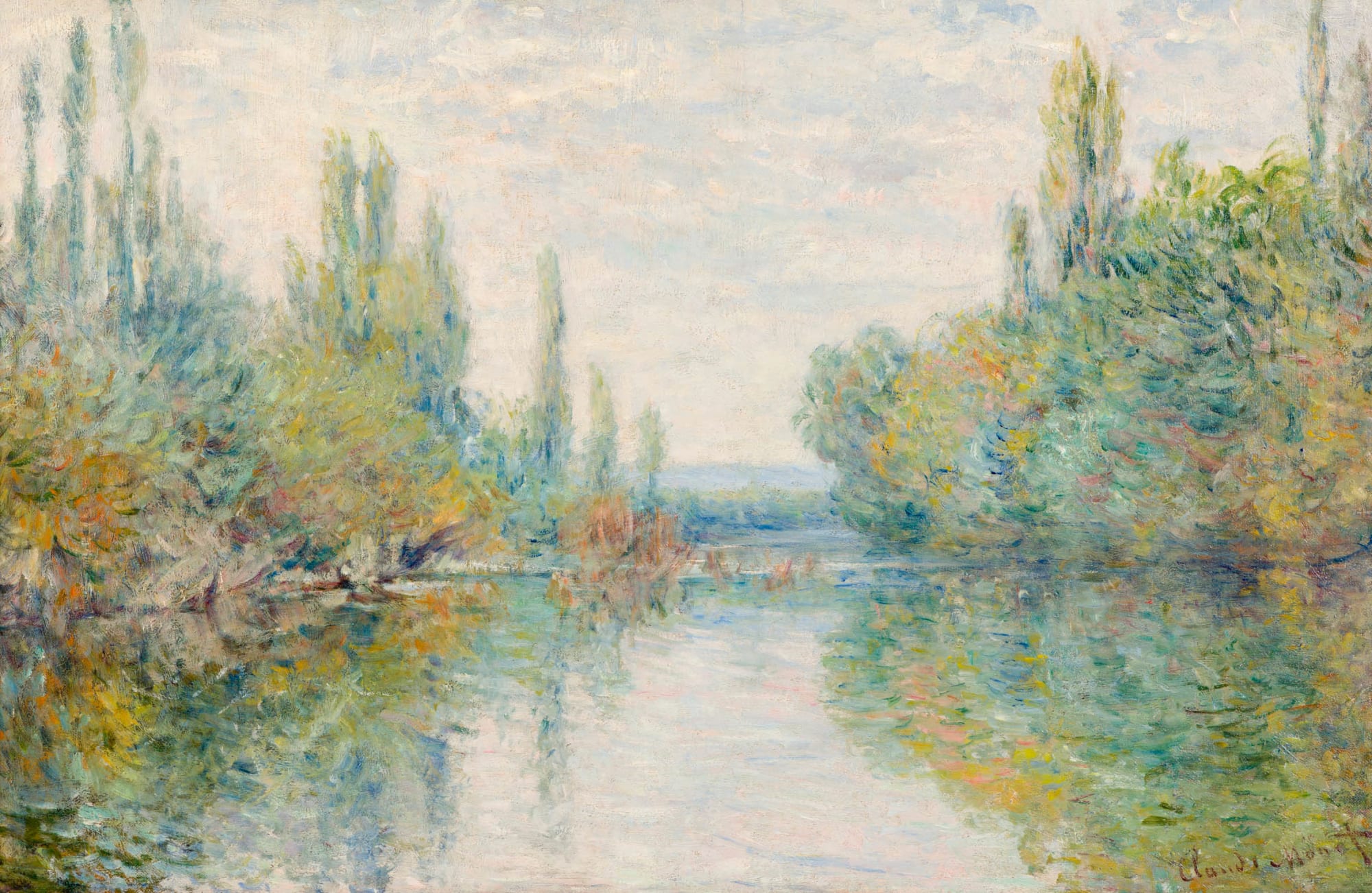
In the painting there's a delicate interrelation between colours - you have browns/greens/blues in the dark parts, and more whites/yellows/blues/pinks in the light parts. I wouldn't describe it as bland, though it is in a sense washed-out. BotW doesn't, and probably can't have that level of handling of shades colour in the enviroment graphics if nothign else because of the technical constraints of the Switch hardware.
Looking at the screenshot, what can you say - you can say that it's nice that the green/yellow of the sky is mirrored in the green landcape with yellow rivers. And the back-lighting of the sun is helping give definition to some of the mountains/hills, which is nice. But I don't see very much subtle going on with the landscape.
Looking at the art, you can see a lot more dynamic range, clearer silhouetting of mountain ranges at various distances, whereas the actual game is more monotone-green. You can also see the fog doing a lot more work of making the shape of the land clear. There are some bits of fog/mist in the screenshot as well, but they're not doing as much heavy lifting in terms of giving shape to the landscape.
The Switch is really limited on the hardware front, and I can't imagine what kind of trade-offs the art team had to make to get to where they are - it's a very difficult balancing act that I only understand a small part of. Nintendo also tend to be very conservative/restrained in their 3d style (I remember being somewhat unnerved by Ubisoft's "Mario + Rabbids Kingdom Battle" Mario game, because it went super high-production-quality).
It feels a bit cheap to give as an example, but the 3D MMO Love by eskil steenberg tried to emulate the impressionist style, and did a striking job:
https://imgur.com/9U18eRZ
The bloom effect is doing a lot of heavy lifting to make the bright colours pop, but even in the less glowy areas there is quite subtle layering of colours going on and one does have the feeling that the colours are playing with eachother.
( https://www.youtube.com/watch?v=Cc02ijaw-Tg a video of it in action, if you are curious ).
As another comparison, looking at elden ring you can see they've gotten 'using fog to make landscape silhouettes pop' down to a fine-art (maybe they're even over-reliant on it)
https://imgur.com/a/5GEePwL
And looking at the landscape you have really nice looking brown/oranges in the fields in the foreground, black/greys/browns in the mid-ground, rocky cliffs, fog is actually glowing, and you have some green forests in the top-left. That's a lot of nuance for what's essentially a brown landscape. BoTW doesn't have that - would it have it if the team had the hardware capabilities and time and budget? Who knows...
Oh, I see. I disagree that the original HZD had a pretense of realism though. The remastered version does and well illustrates the uncanny-ness https://www.youtube.com/watch?v=IlWK_ELBW08 . The outrageous god rays, bloom and lens flare in the remaster compensate for that because you can't actually see anything due to them blinding you...
I think with enough exposure to the overdone contrast ratios, you start to get tired of it. It sacrifices a lot of clarity.
I agree it does look good in some cases, for example I enjoy the look of Battlefield 1 a lot, but when playing it I often noticed I had issues seeing detail in darker areas.